

Learn about Sound & Vision
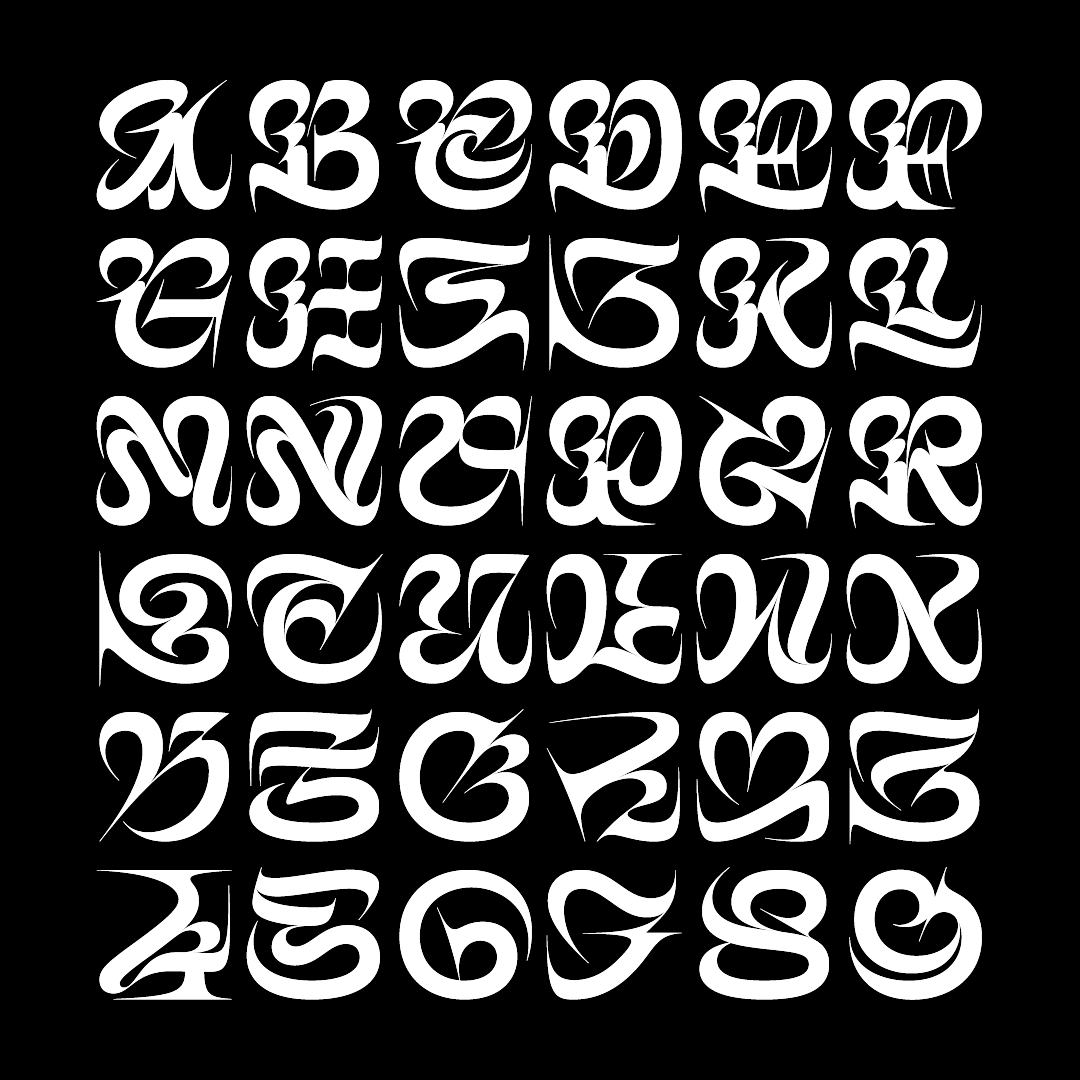
Never has typography been leveraged as ‘brand experience’ to such a degree as it is today.

Navigating the intersection of typography, culture, and identity.
Juan Villanueva’s story is one of embracing the intersections of technology and art, culture and identity, and his work reflects a unique blend of these influences. Based in New York City, Juan is a Senior Type Designer at Monotype, a letterer and an educator passionate about fostering community and accessibility, especially for marginalized voices.
Juan’s earliest creative memories involve drawing anime and recreating caricatures from magazines. His parents nurtured his creativity by providing art supplies, helping plant the seeds for a future in design. His interests in technology and science, combined with these early experiences, ultimately led him to typography — a discipline where drawing letterforms and crafting typefaces combine art, creativity, and technical problem-solving. It’s this unique combination that fuels Juan’s passion, blending artistic expression with the precision and potential of technology.
“I’m always seeking new creative challenges, especially where art, technology, and craftsmanship come together.”
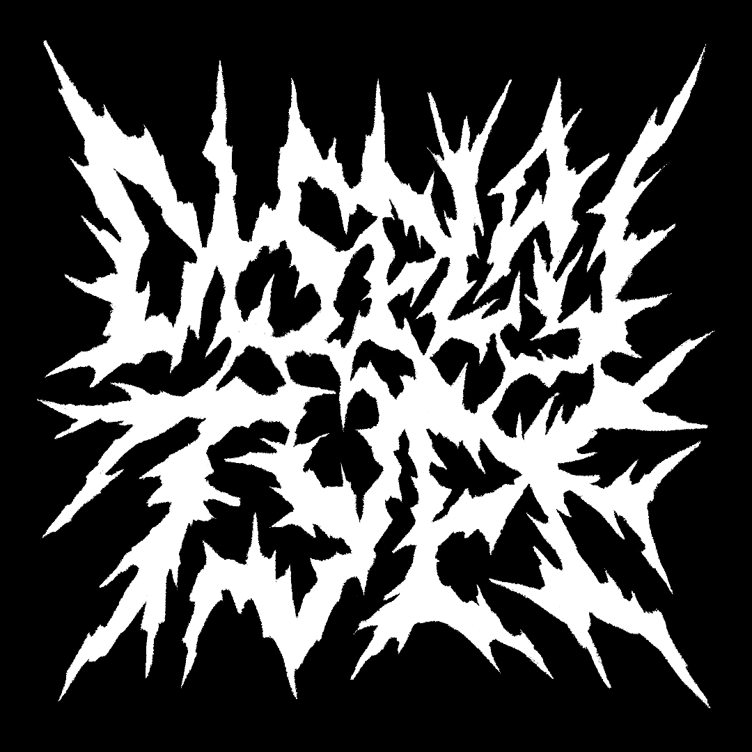
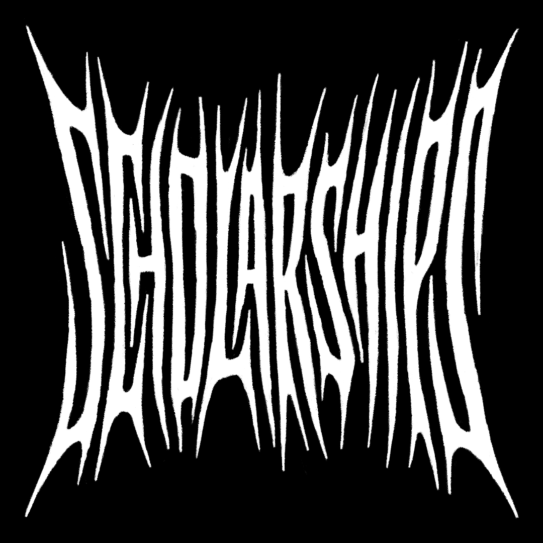
Juan’s approach is deeply personal, shaped by his identity, cultural heritage, and passion for politics, art, and design. It’s also constantly evolving. Juan explains that he resists sticking to one style and views his design journey as a continuous evolution fueled by experimentation and exploration of new themes. He’s inspired by an eclectic range of influences, from the raw, unfinished aesthetics of death metal lettering to the carving techniques and intricate textures of linocut prints, particularly those he experienced during a recent visit to Elizabeth Catlett’s exhibition at the Brooklyn Art Museum.
Living in New York City as an immigrant from Lima, Peru, Juan navigates the complexities of identity and immigration. He acknowledges both the challenge and the beauty of finding one’s identity in such a diverse environment, where “you’re trying to be yourself in a giant mass of diverse people who sometimes see you and sometimes don’t.” Juan sees type design as a powerful tool for amplifying diverse stories and voices. Through his role as an educator, he focuses on creating spaces where marginalized voices can share their stories and make their presence known in the broader world of type design.
This understanding of type as a vehicle for identity and expression informs his professional work. As a type designer working with major brands every day, Juan sees type as a crucial component in conveying brand values — he places it on the same level of importance as color, photography, or sound.
“Good typography is defined by its context. Every client is unique and finding that perfect combination of typographic styles that allows our clients to connect with their audience is what good typography is all about.”
These subtle, emotional aspects of type have always been vital to its impact, and Juan doesn’t see that going away. In terms of trends, Juan observes a growing preference for designs that appear handcrafted, revealing the human touch behind them. He attributes this to a broader reaction against AI. “What I think is driving that trend is the idea that ‘AI can’t do this — yet, so we’ll do it.’ The key word here is ‘yet,’ because, while AI may eventually learn to replicate these traits, creatives will keep pushing the boundaries. That means there will always be a ‘yet’ for AI to catch up with.”
Juan’s personal philosophy shapes his advice for the future, “Don’t wait until it’s too late.” If you have an idea, and if it’s safe to pursue, act on it now. “There’s so much happening in the world, but if you have a project that could nurture your mental health, benefit others, or simply bring you joy, don’t wait for the ‘perfect’ moment. The joy and impact it can bring — to you, your loved ones, or your community — are priceless.”
“The joy and impact it can bring — to you, your loved ones, or your community — are priceless.”
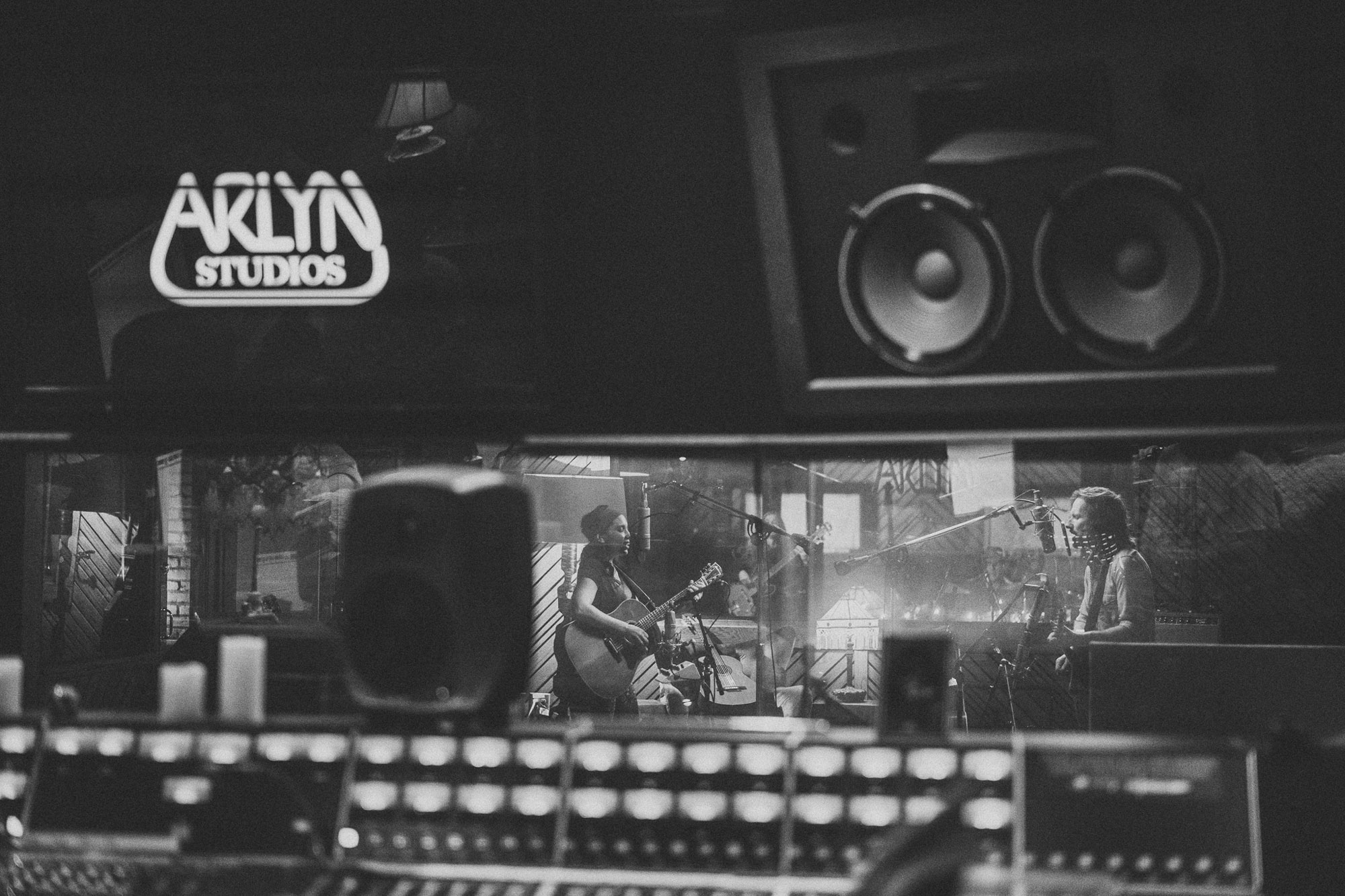
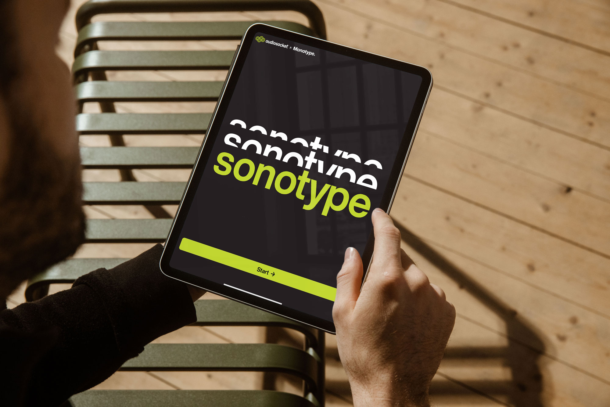
Juan is the co-creator of Sonotype, a music and font discovery tool for designers and brands developed in response to Sound & Vision.
Explore
Type Trends 2025. The latest in type design, from the Monotype Studio.